

Coverage Monitoring for Critical Comms
//OUTCOME
Shipped to production. Eliminated reliance on drive testing as the sole diagnostic tool, giving teams spatial visibility into coverage gaps for the first time.
//PROBLEM
Coverage issues surfaced late through anecdotal reports with no spatial visibility into live signal quality
//SOLUTION
Real-time and historical RF monitoring in one interactive map with Change Detection, threshold alerts, and device-level drill-downs
//CONTRIBUTIONS
Research, stakeholder workshops, IA and flows, prototyping, design system components, user validation
//ROLES
Sole Product Designer, research through launch
//USERS
RF engineers, system admins, and field ops teams
//TOOLS
Figma, FigJam, design system library, ArcGIS, Google Workspace
The Problem
In public safety, a dropped radio call can mean a missed moment to save a life. But when coverage issues occurred, agencies had almost no way to know about them until after the fact — if at all. Reports were anecdotal and often came days late. Field technicians would drive out to test a location, frequently unable to reproduce the original conditions. The only systematic tool for coverage analysis was physical drive testing: expensive, slow, and entirely reactive.
The telemetry already existed. Thousands of devices were generating signal quality data on every call. The problem wasn't data — it was visibility. There was no way to see it on a map, compare it over time, or answer the most critical question: is this a device problem, or a dead zone?
SIGNAL QUALITY DATA EXISTED, BUT THERE WAS NO WAY TO SEE IT.
Taking Ownership of a Stalled Initiative
When I joined, there were rough mockups from a previous team — a spectrum grid on a map, visually illustrative but not grounded in use cases or user research. I set it aside and started over: user stories, stakeholder interviews, secondary research, and VOC sessions with representative users across RF engineering and operations.
The first major obstacle was technical. Early prototypes used a square grid, but squares plotted on a sphere at varying latitudes warp into inconsistent rectangles — visually misleading and geographically inaccurate. I stopped, looped in architecture, and researched the problem from first principles. The answer was hexagonal grids, which tile uniformly across a sphere and maintain consistent neighbor distances in all directions. I made the call, rebuilt the approach, and established a geospatial visualization pattern that became reusable across the platform.
One Product, Two Teams, Incompatible Visions
Midway through the project, a second product team identified overlapping needs and wanted the coverage map built into their platform as well. For months I was the only designer supporting both teams — running separate discovery sessions while they remained largely unaligned with each other.
Their requirements were genuinely incompatible:
- Real-time vs. monthly aggregates
- Dynamic user-set thresholds vs. hardcoded values
- Mobile-first vs. desktop-only
Building one product to satisfy both would have produced a broken experience for users of each. I compiled the full requirements comparison, documented the conflicts, and called a joint alignment meeting with both product managers, architects, and engineering leads. The outcome: one team conceded, tabled their version for a future release, and I shipped a focused, well-scoped feature with the team that had the stronger business case.
This also freed me to work closely with a Poland-based engineering team under a two-hour-per-day time overlap — which forced async-first collaboration, detailed behavioral specifications, and disciplined prioritization.
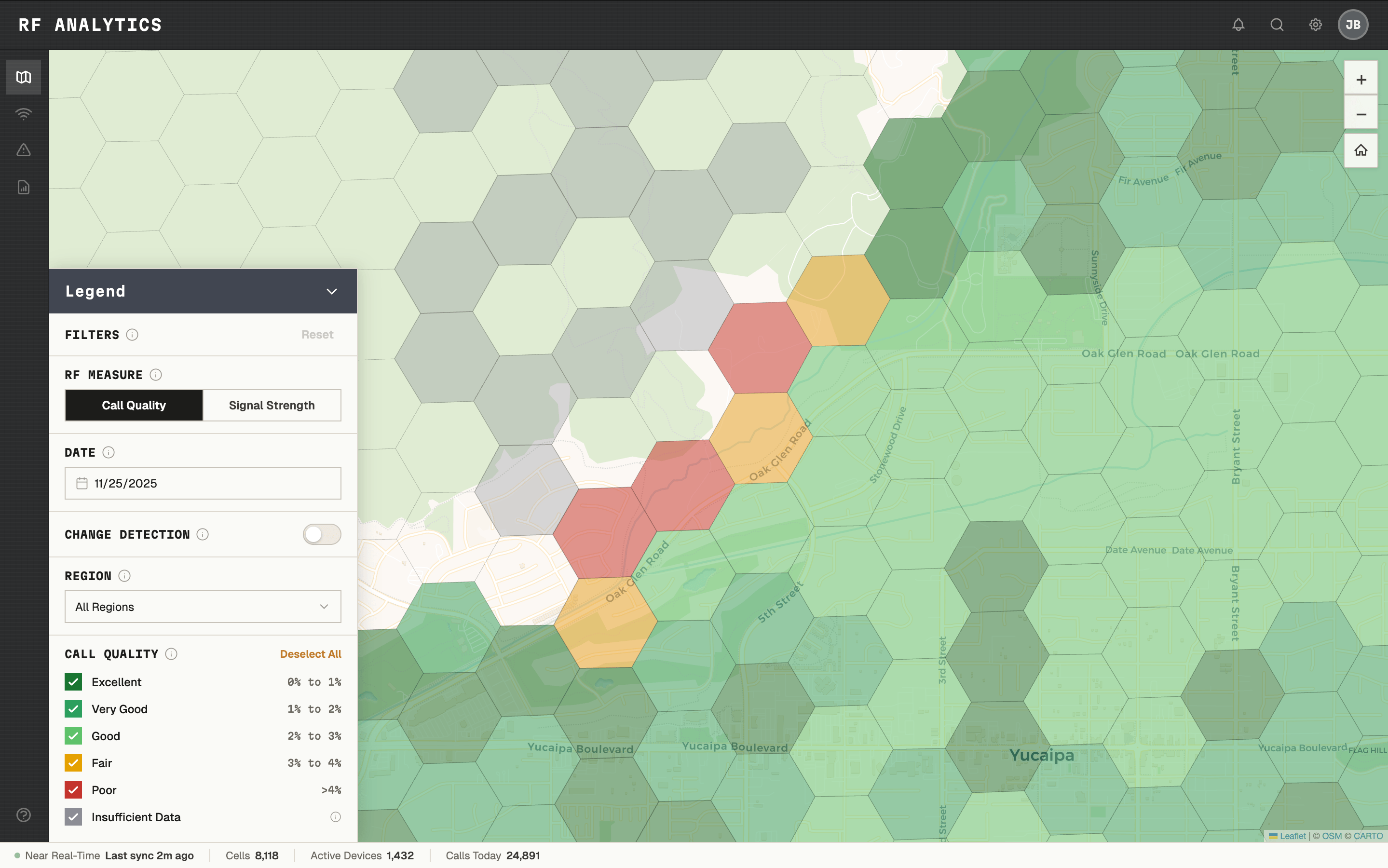
Defining the Legend
Choosing color thresholds for the map legend turned out to be one of the most complex decisions in the project. What looks like a design choice — what's green, what's yellow, what's red — was actually a technical, legal, and UX problem with real contractual implications. Labeling a cell "bad" could imply a network SLA violation.
I facilitated workshops with RF engineers, systems architects, and legal to define what "Excellent," "Very Good," "Good," "Fair," and "Poor" meant in terms of actual signal measurements, built the legend accordingly, and documented it for reuse.
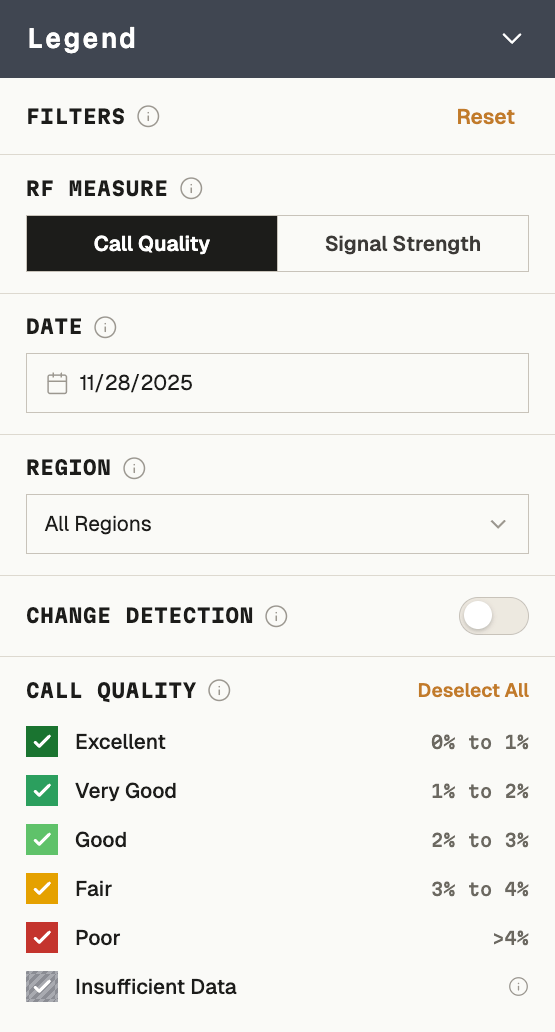
EXCELLENT THROUGH POOR - DEFINED AS MEASUREMENTS, NOT JUST COLORS.
The Design
The core experience was a collapsible, interactive legend panel — hovering over the map, minimizable to reveal the full coverage area — that unified three lenses:
- Call quality — bit error rate plotted across geography
- Signal strength — RSSI as a secondary lens
- Change Detection — how coverage changed between any two selected date ranges
Clicking into any cell revealed a drill-down panel with fleet-wide or individual-device call quality distribution, searchable by device — letting administrators determine whether a complaint was an isolated device issue or a genuine dead zone before sending anyone into the field.
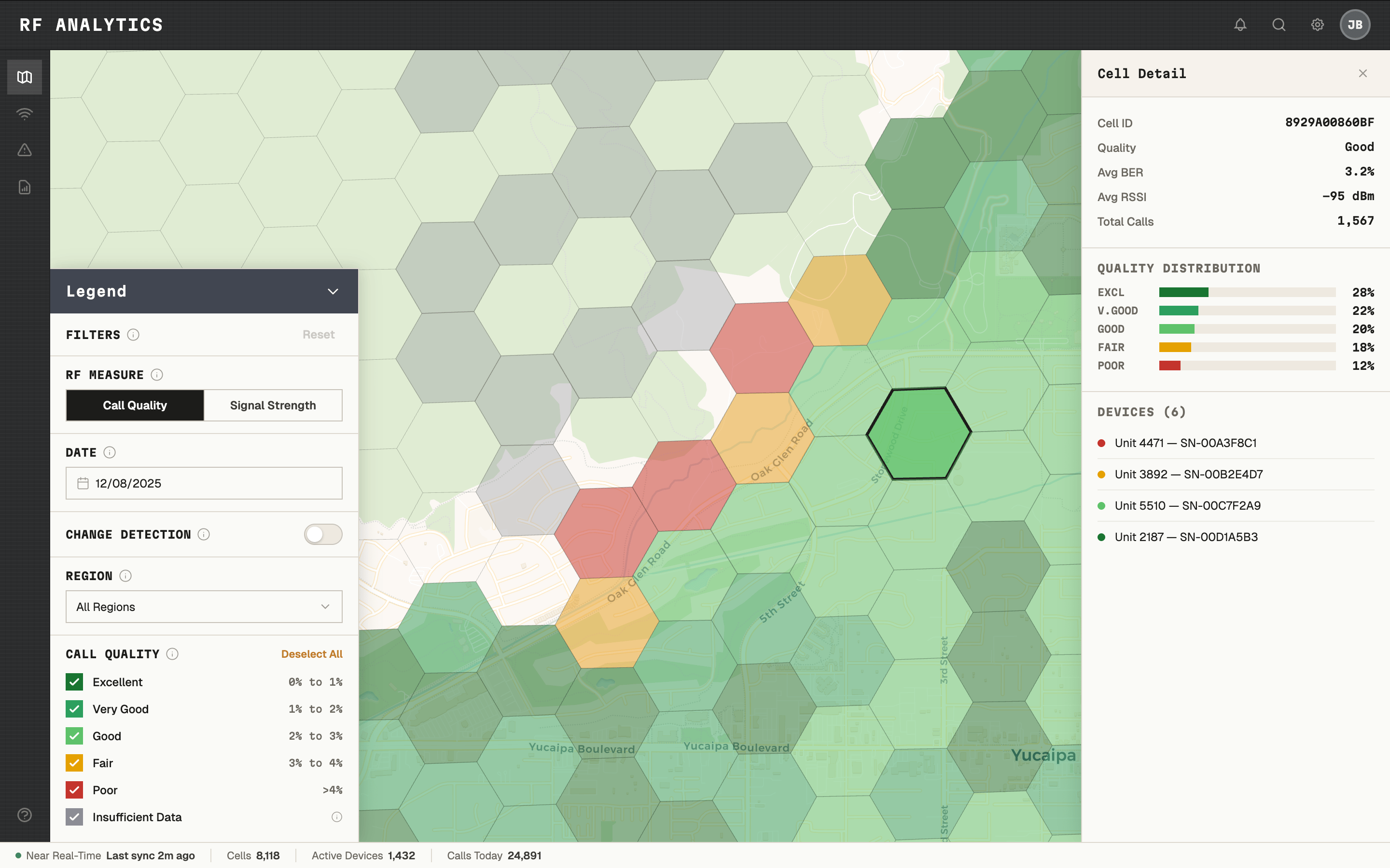
ONE CLICK ANSWERED THE QUESTION: DEAD ZONE, OR DEVICE PROBLEM?
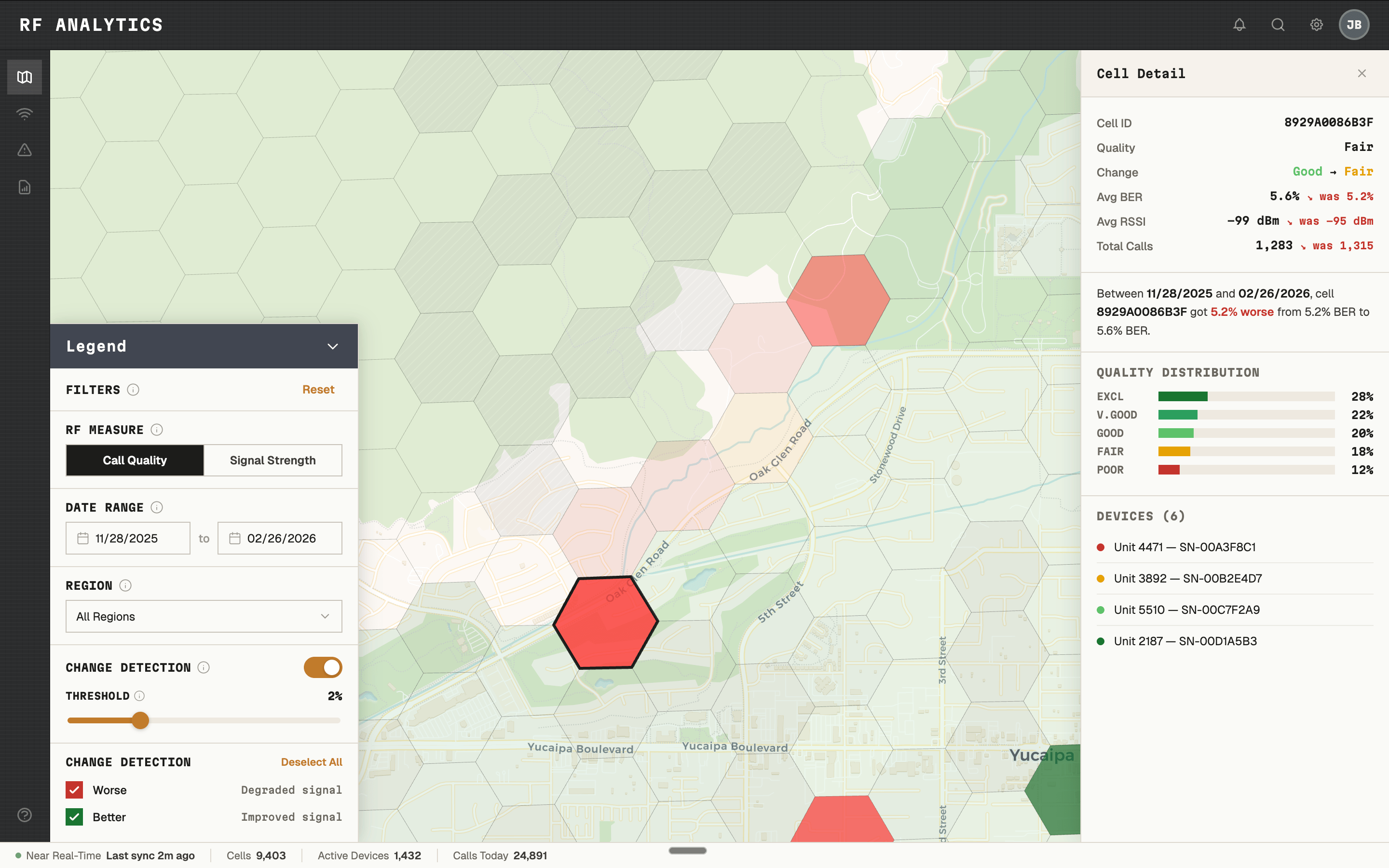
Change Detection — coverage change between any two date ranges, at cell level.
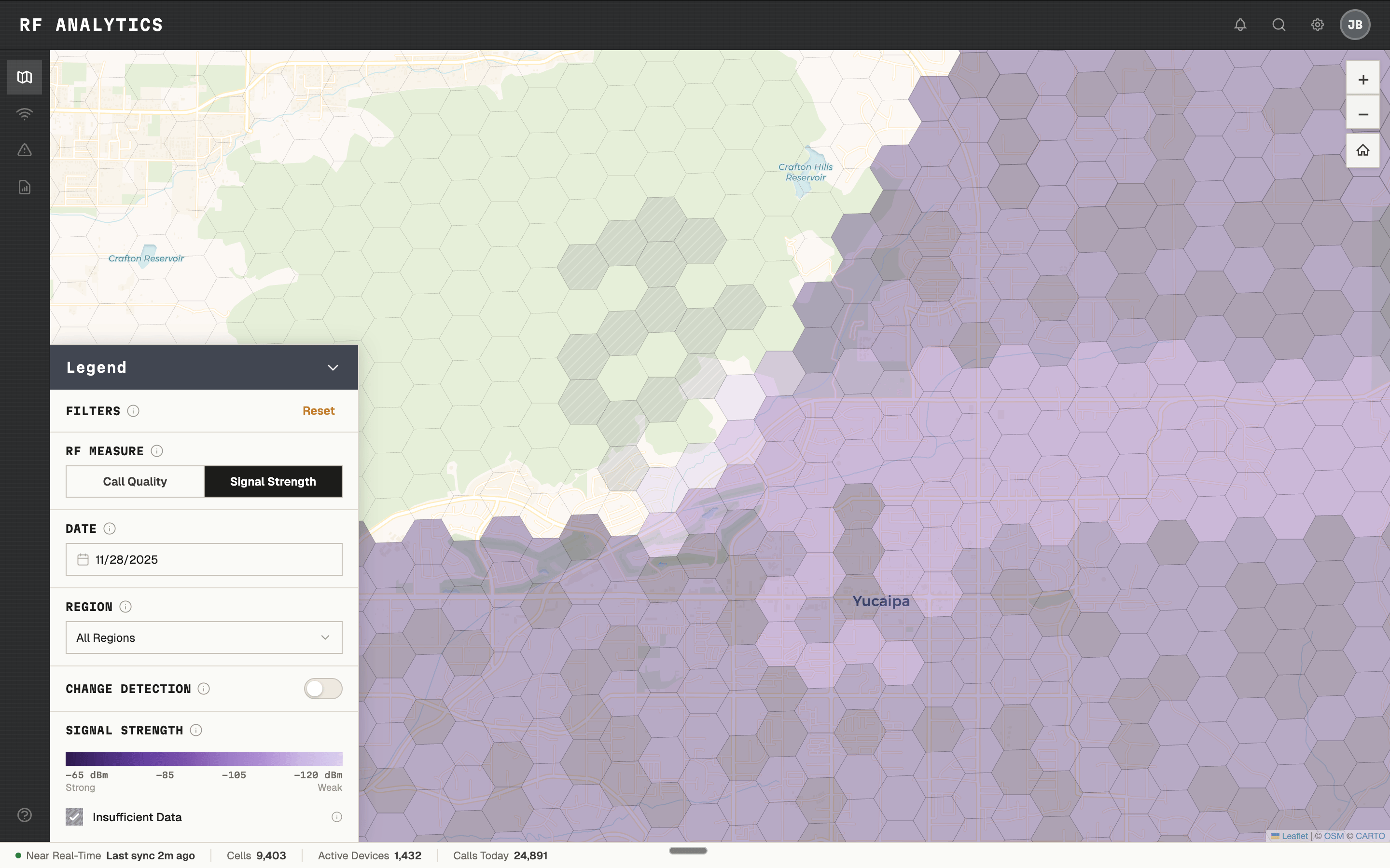
SIGNAL STRENGTH AS A SECONDARY LENS. SAME MAP, DIFFERENT MEASUREMENT.
Outcome
The feature shipped into production. Internal evaluations showed administrators could identify coverage regressions faster, reduce unnecessary drive testing, and answer the device-vs-coverage question without leaving their desk.
"Seeing coverage like this makes it easier to justify where we spend our time. We've wanted something like this for years." — System administrator, user evaluation
The interactive map patterns became reusable standards for future map-based products — the first of their kind in the design system.
This case study reflects real design work. Certain labels, visuals, and data are anonymized or reconstructed from public references. No confidential or proprietary information is disclosed.
© 2026 JOE BALICH

AVAILABLE FOR WORK
V.1.0


