

Fleet Configuration at Federal Scale
//OUTCOME
90%+ reduction in edit time (10x faster) & on-time delivery.
//PROBLEM
Config edits ballooned in complexity during a migration and put a major contract at risk
//SOLUTION
A streamlined editor built around reusable Configuration Profiles
//CONTRIBUTIONS
Discovery, workshops, IA and flows, prototypes, PM + eng collab, direction of UX interns
//TOOLS
Figma, FigJam, company design system, Google Workspace
//USERS
System Admins and Provisioning Specialists
//ROLES
Senior UX Designer & Design Lead
The Situation
A critical provisioning tool was mid-migration from a legacy desktop client to a cloud-native web app when QA uncovered a serious problem: routine configuration tasks that had been fast in the old tool had ballooned in complexity in the new one. Simple fleet edits now required long, multi-step sequences with duplicate input, unclear validation, and no sense of progress. It wasn't just a usability issue — a major state agency contract required the new platform to ship with full feature parity and an improved editing experience, on a fixed three-month deadline.
I was brought in to fix it.
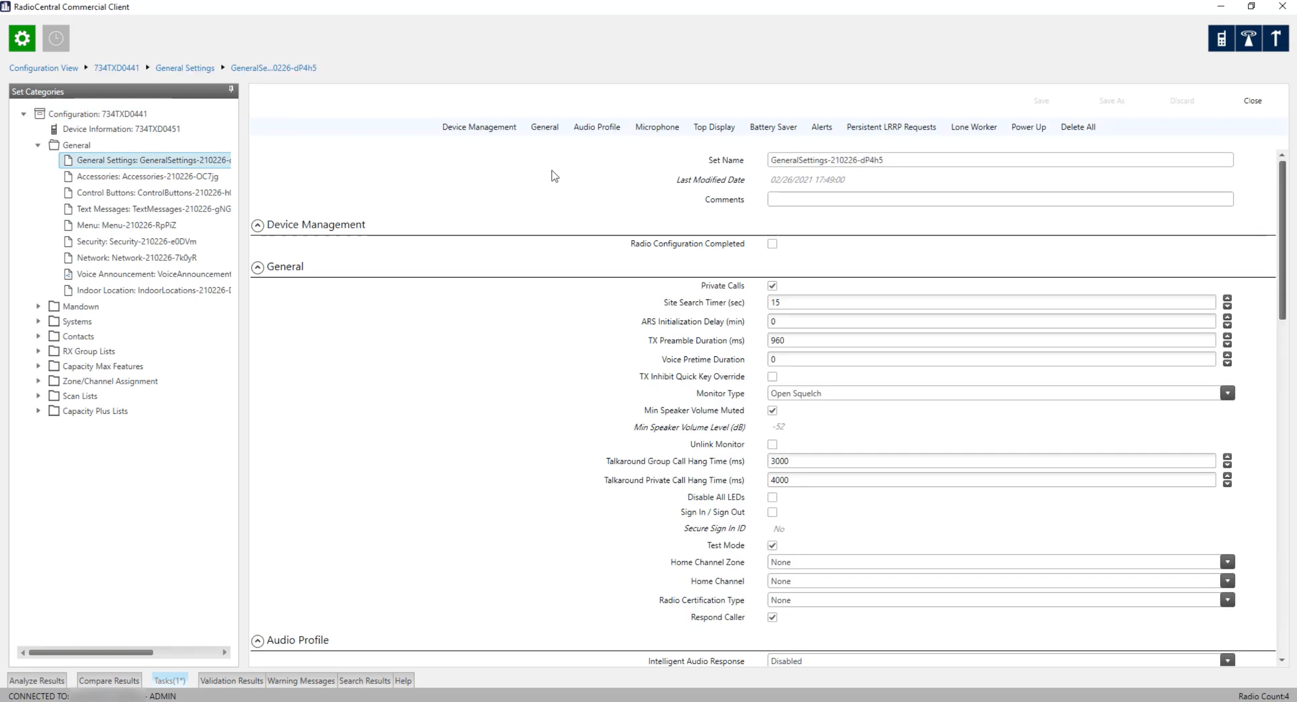
EVERY CONFIGURATION SECTION LOOKED LIKE THIS.
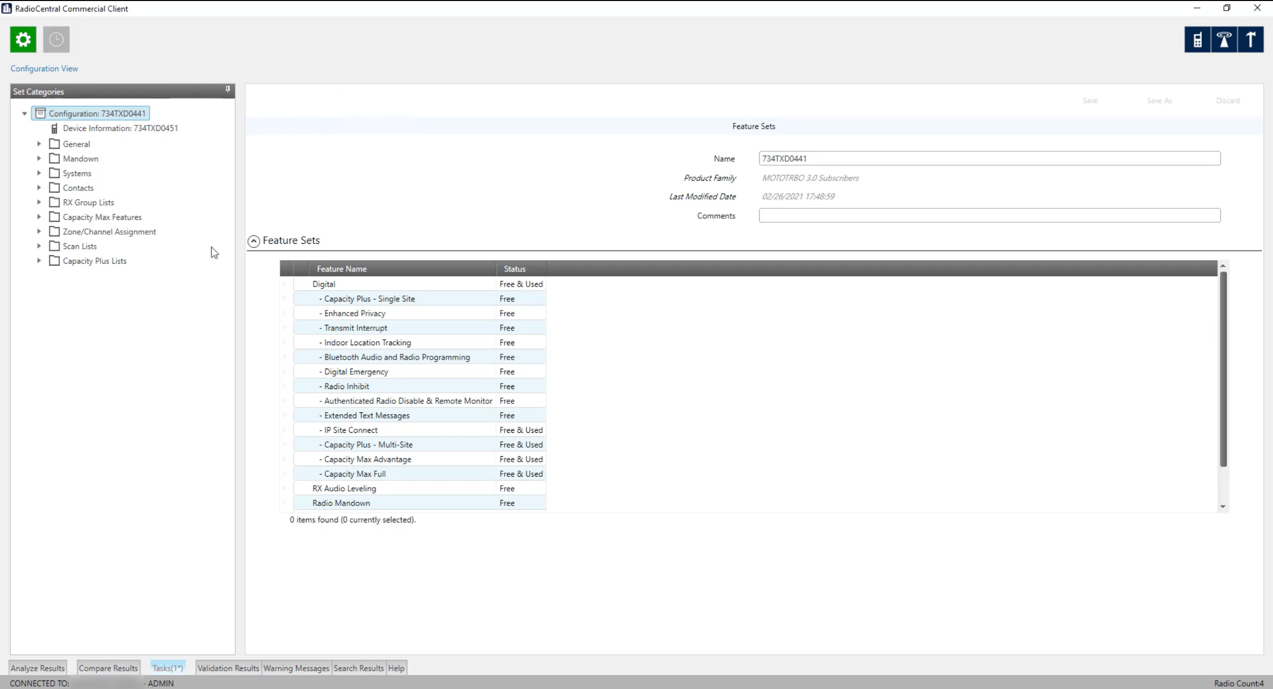
Configurations managed as files. No profiles, no inheritance, no reuse.
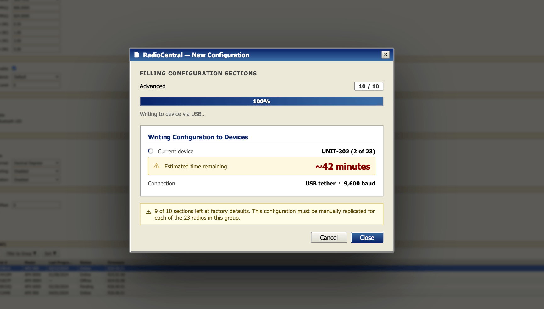
Estimated time to update one radio. Multiply by 23.
Fly to the Problem
I recognized immediately that remote collaboration wouldn't be sufficient. I made the case to fly to headquarters for an intensive week-long workshop with the three lead architects behind the editing system. Working in person let me develop a complete understanding of the technical constraints and solution space far faster than async iteration would have allowed — and gave the architecture team real-time design feedback as we evaluated options together.
Back home, I recognized the second problem: the prototype required to validate and ship the solution was enormous and I had under three months to build it, validate it, and hand it off to engineering. I escalated to my manager, secured budget approval, and hired a UX researcher and a UX design intern within the first month. In parallel, I built a scalable Figma component library — puzzle pieces the team could use to assemble flows efficiently once onboarded. I designed every screen, pattern, and state; the team stitched it into a complete, reviewable prototype. Daily reviews with PM and engineering ran throughout.
The Design
The central insight was that the old tool's complexity wasn't inherent to the task — it was a product of how the interface required users to work. The solution was Configuration Profiles: create a template once, apply it across a fleet. This eliminated the rebuild-from-scratch pattern that made large-scale updates so costly.
Around that core:
- Clear sequencing — condensed and reordered steps to remove unnecessary back-and-forth
- Review before apply — an explicit confirmation showing exactly what will change across the fleet before anything is sent
- Immediate validation feedback — errors surfaced at input, not at submission
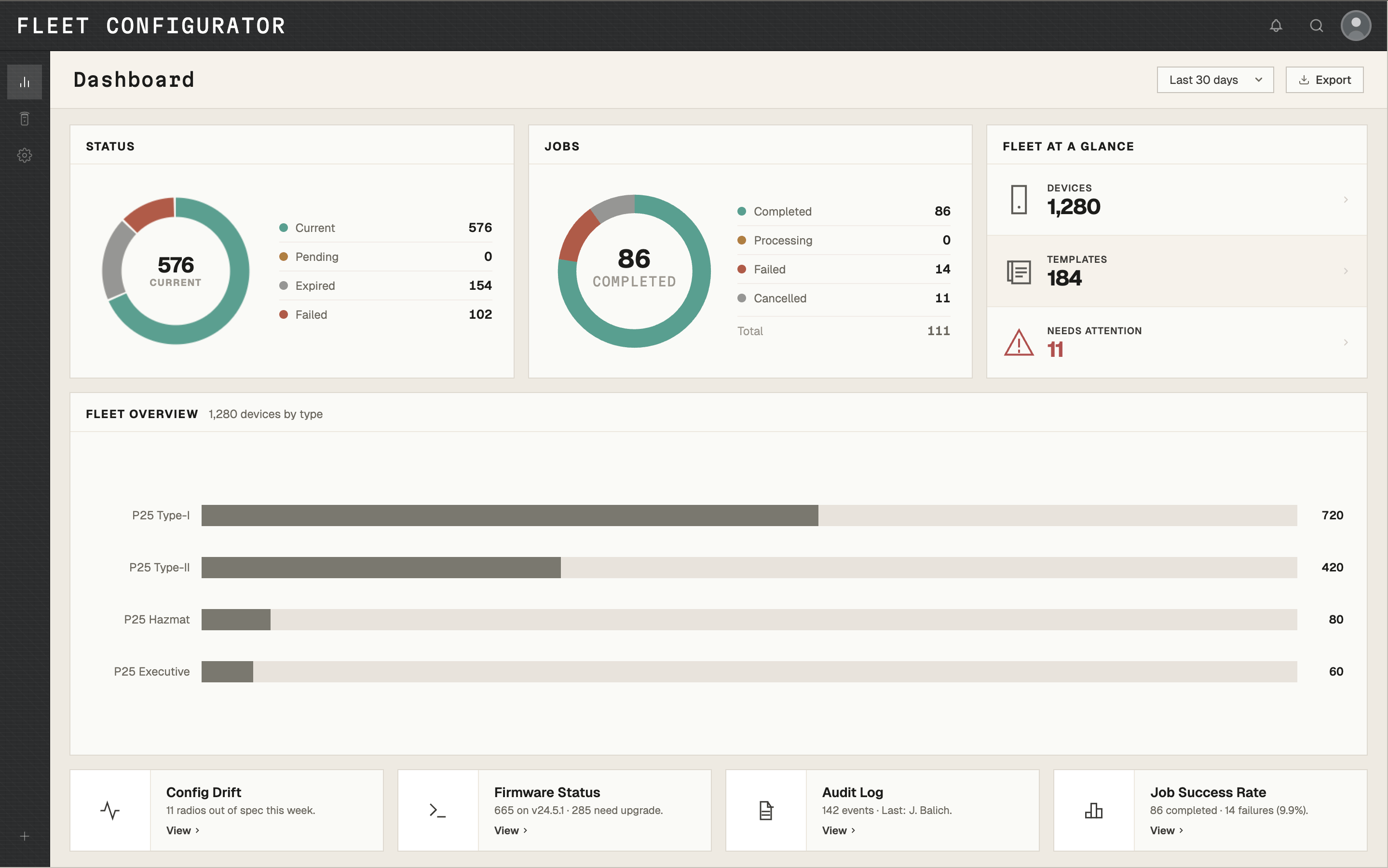
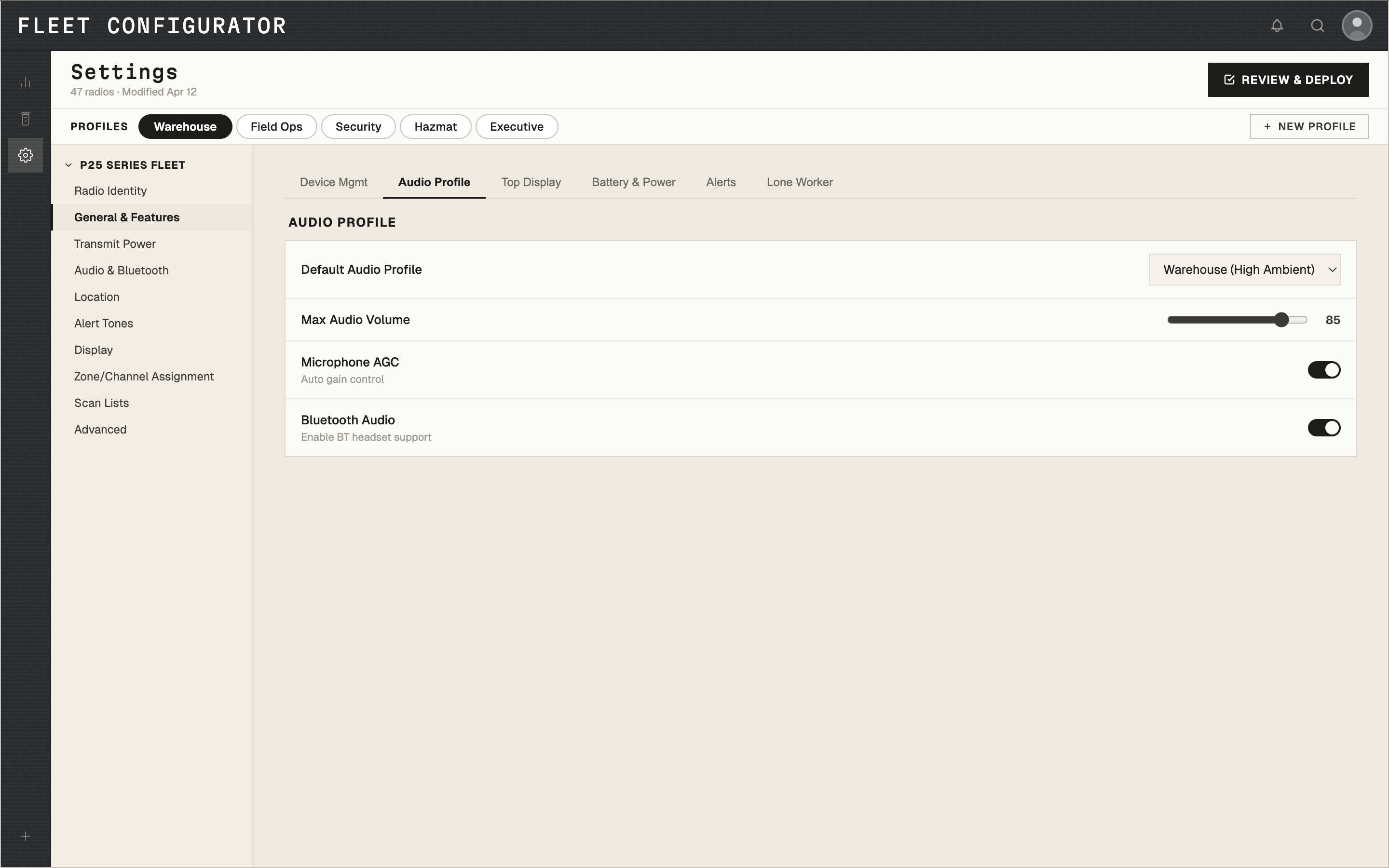
Settings organized by function. Every field pre-populated from the existing profile.
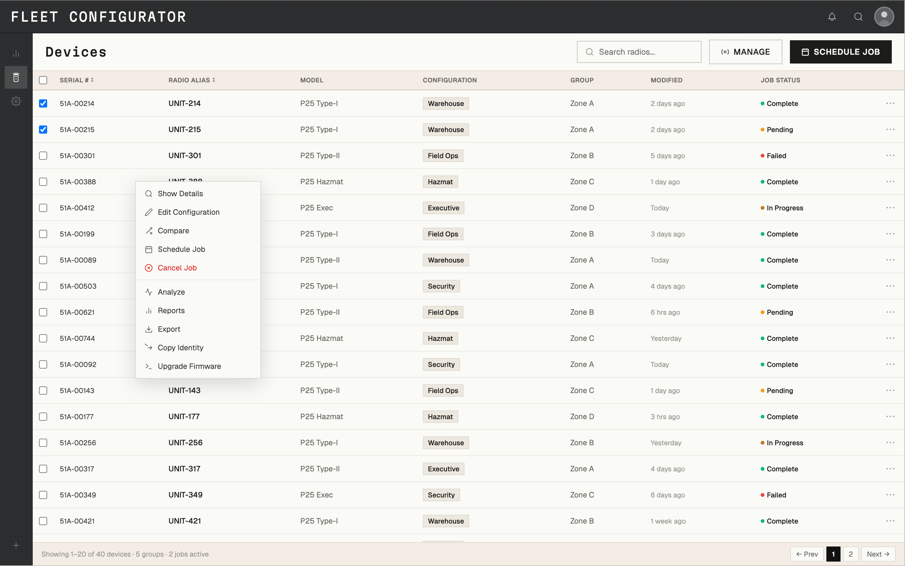
40 devices, 5 groups, all statuses visible before touching anything.
The 150+ screen prototype was approved by senior leadership and channel partners on first pass. The redesigned editor is currently rolling out as part of the broader cloud migration — full deployment to federal and state agencies expected by end of 2026.
Outcome
Edit time for common fleet update tasks dropped by over 90%, measured against QA benchmarks from the legacy tool. The prototype served as the single source of truth for engineering throughout build, reducing ambiguity and rework. Shipped on time, on budget, as part of a FedRAMP-authorized rollout.
Shipping this reinforced that the designer's job in a high-stakes moment isn't to protect the design — it's to protect the timeline and the team.
Quotes
"His prototype and walkthrough gave us the exact feedback we needed. Engineering keeps praising the clarity it provided." —Director of Software Engineering
"Joe jumped in during crunch time, led daily design sessions, and delivered a new editor model the business approved on first pass." — Senior Product Owner
This case study reflects real design work. Certain labels, visuals, and data are anonymized or reconstructed from public references. No confidential or proprietary information is disclosed.
© 2026 JOE BALICH

AVAILABLE FOR WORK
V.1.0


